I have been following baseball for a little over thirty years now (the '81 World Series is the first I can recall), but in all this time the game's uniforms have never been as dull as they are now. Back in the 80s teams were still quite daring, but the retro impulses in the game that came in the wake of Camden Yards in the early 90s meant a return to the classic look. Nowadays this has calcified into uniforms without flair worn by players who prefer a baggy fit and no stirrups showing. A recent episode of the Sully Baseball Daily has inspired me to present some evidence for my thesis.
Just check out this photo of the 1986 Mets, their striking racing stripes, tight pants, and stirrups pulled high. They look just like the magnificent bastards that they were.
Now check out the more recent vintage of Mets uniforms in action:
Their pantaloons are ridiculously baggy, very little sock is in evidence, and the uniforms are elegant but totally without distinction. Sort of like the Mets in the recent years, actually. Is there any doubt which set of uniforms looks cooler?
Some teams once had great daring in their uniforms, and were willing to really break the mold. Take for instance the Houston Astros. I always loved their "tequila sunrise" pullovers and the pants with the number on the pocket. While this look got toned down a little later, it still looked futuristic. Nowadays the Astros have kits that are as bland as bland can be.
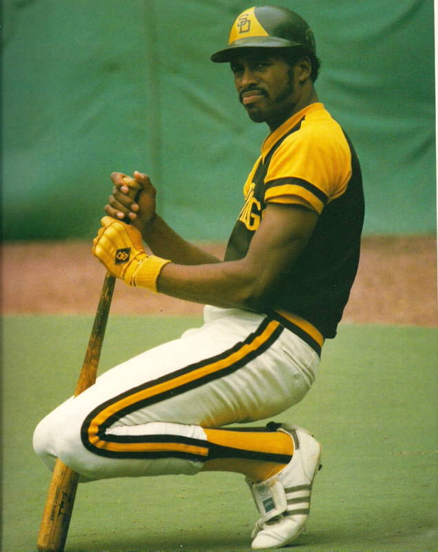
Some of the uniforms of the 1970s and 80s have been accused of being ugly, but at least they had some style. Take for instance the yellow and brown "Taco Bell" unis of the Padres, which incorporated a color palette rarely seen after 1981.
Dave Winfield just looks great here, and the racing stripe's swoosh is mirrored by his exquisite sideburns. Baseball players have always had the flashiest facial hair of any sport, going all the way back to the wax moustaches sported by the likes of King Kelly in the 19th century. Now compare this photo to a representative image below from last year's Padres.
The color palette is just blah. These guys could be from any team, whereas in the old days only San Diego would dare combine brown and yellow.
While good taste would seem to dictate that leather belts are a better option than the sansabelt pants of the 70s and 80s, they actually gave players a more streamlined appearance. Take a look-see here at Andre Dawson in 1987.
He looks sleek and powerful, every inch the MVP of that year. The pullover shirt and elastic waistband actually add to the effect. Now look at this:
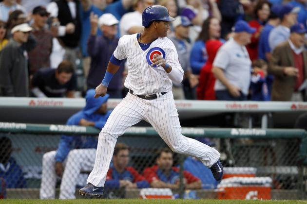
Here's a more "classic" take on the Cubs' classic look in their current unis. However, the uniform just seems to hang there, like pajamas, and the pants are so long it looks like they will get caught in the cleats.
Enough of the comparisons, below are some examples of uniform styles of the past with a healthy dose of flair.
Road blues!
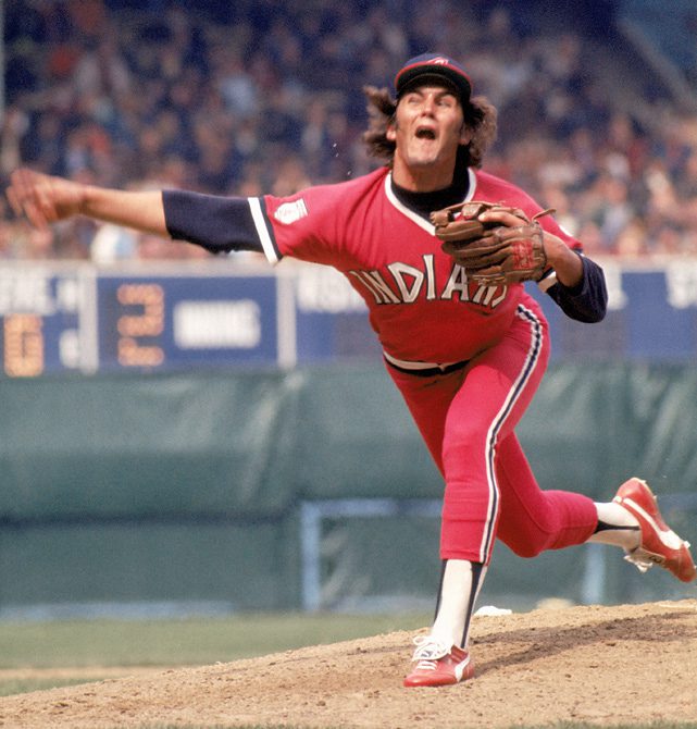
Cleveland Indians uniforms marginally less offensive without Chief Wahoo!
The Pittsburgh Pirates sporting the bumblebee look and pillbox hats!
The Expos using traditional colors in an interesting fashion!
The Seattle Pilots' captain caps!
The Phillies' unique maroon color scheme!
(or maybe not)
The Oakland A's' white shoes-gold jersey combo!
There you have it, but I could go on and on and on. Baseball is a sport where the uniforms matter more than in any other. In a crowded sports landscape I would prefer that the game go with some more visual flair, even at the risk of those uniforms being labelled "ugly." It would certainly make things more interesting.


No comments:
Post a Comment